Post contents
This is an update to an existing article
If you haven't yet, check the original article below.
Hard grids & baselines: How I achieved 1:1 fidelity on Android
For years, the difference between web and native line heights has been a problem for designers. Figma behaves similarly to the web, which ended up being an issue when designing for Android and iOS.
In this article I’ll cover how you can now fix this in Jetpack Compose, and make your Android app TextViews match your Figma mockups.
Preface
For the entirety of this article, I have defined 3 different concepts that will help illustrate the differences between how Figma and Compose draw their text.
Text vector bounds:The minimum height required for the text vector.Line height:Defines the height of the line. Figma and Compose perform this differently.Text container:The outer bounds of the text.
How Compose works
We’ll start with Compose, as it contains more features. Compose has a lineHeight attribute, and an alignment attribute. These function, by default, as follows.

From this example, we can notice the following:
- If the
lineHeightvalue is smaller than the minimum bounds of the text vector, it is ignored. In the example above, the minimum height for the text is24sp. - If the
lineHeightvalue is larger than the minimum bounds of the text, space is added to fill the desired line height. - This extra space can be redistributed with the
alignmentattribute. Compose providesTOP,CENTERandBOTTOMalignment options.
How Figma works
Here's how setting a line height to a text box behaves in Figma:
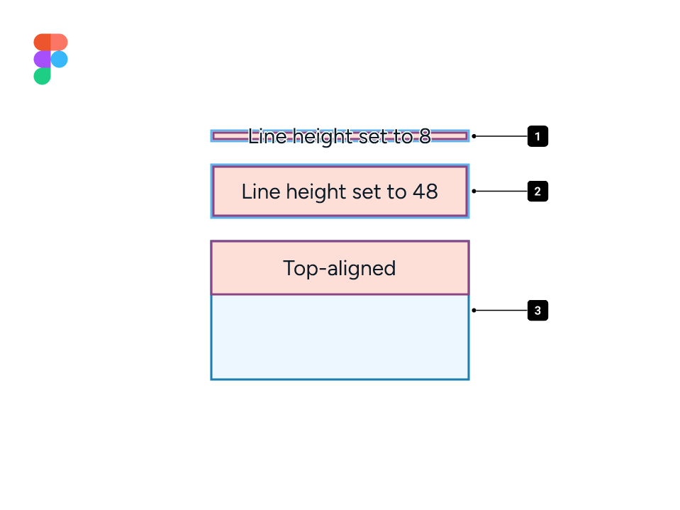
- The line height in Figma can be smaller than the minimum bounds of the text.
- Setting a line height in Figma causes the minimum bounds of the text to change to the desired value.
- A manually resized text container in Figma, which lets users change the alignment of the line. Let’s look at it further.
Alignment in Figma
In Figma, all text boxes are set to Hug by default. This means the text container size is determined by the line height, unlike Compose.
Alignment options have no effect unless the outer container height and the line height differ. In the example below, we have a text container size that is smaller than the line height.

Baseline grids
I previously suggested using firstBaselineToTopHeight and lastBaselineToBottomHeight to apply baseline grid alignment and build matching Figma components.
I now advise against it.
Originating in print design, baseline grids were useful to define text spacing for a pleasant vertical rhythm. Designers quickly went on the pursuit of baseline alignment and baseline-relative spacing in UIs.
In practice, it means a ton of legwork to move, at best, 3 pixels.
But let's say you've done the work, and you've now set up all of your text components and paddings in developer handoffs, and you're good to go. What does that mean for your UI?
Baseline grid alignment with icons
To illustrate one of the issues with baseline alignment, let's look at an example where a designer would like to place a baseline-aligned TextView next to an icon. The icon is set to 24dp and the text is set to 16sp, which, when baseline shifted, gives an overall height of 20sp. In order to center the label with the icon, the text must be top-aligned.
The problem with this is that, whilst the icon is set to dp, the TextView scales with text size. When scaled, this is the result.

In most cases, developers will account for this by centering the TextView within the layout.

This essentially nullifies the baseline alignment that was put in place. Developers can fix this by setting the icon to scale off the text size.
Baseline grid alignment in containers
Containers with single-line labels also suffer from visual misalignment when dealing with baselines. Here's a button with all three alignment options; bottom baseline, line height centering, and top baseline.

You'll notice that, when dealing with baselines, you may be given situations where it is impossible to maintain alignment while following a baseline grid. These edge cases can be handled individually, but once again, they take significant amount of effort on the part of both designers and developers to fix.
The over-engineering for the sake of ~3px is simply not worth it. No platform has baseline grid or baseline spacing APIs, and everything you interact with on a daily basis has been built without it. Baseline grids in interfaces are a solution looking for a problem.
Takeaways
Knowing this, here's a summary of what you should keep in mind when deciding whether to use baseline grids.
| Methods | Cons | Pros |
|---|---|---|
| Baseline grid alignment | ||
| Line height centering |
Figma, Compose and trimming
A new behavior is emerging to tackle the baseline alignment needs of designers and it's called leading trim! This process is being done in collaboration with Microsoft Design, and you can read more about it here.
Figma and Compose both have a trimming feature for text, but they are very different.
Figma's "leading trim"
Figma's leading trim option will reduce the outer bounds of the text layer to align with the font's baseline and cap height. This essentially means designers can leverage this to get precise spacing from a text box's baseline and the start of another. This feature does not affect the line height.

Compose's LineHeightStyle.Trim
Compose's functions differently. As we've established earlier, Compose will not allow a line height to be smaller than the minimum bounds required for the text vector.

Recap
| Trim feature | Behavior |
|---|---|
Compose's LineHeightStyle.Trim | Will reduce a TextView to the minimum required size for the text vectors to fit in. |
Figma's Leading trim | Will force a text box's height to be from the text's baseline to its cap-height, with letters and symbols commonly going outside its boundaries. |
Should I use it?
The clear answer, at the moment, is a hard "No." This is because not only is the trimming feature inconsistent between Figma and Compose, but the web version is still being drafted, while an iOS trimming feature seems unlikely to happen anytime soon.
Conclusion: How to match Figma in Compose
After learning all about alignment and baselines, let's get down to the easy part — matching your mockups!
Thanks to the Compose APIs shown in this article, translating Figma text styles is by far the easiest part. Here's a quick table
In order to match Figma in Compose, developers can default to the following values.*
*We're using 16 as a reference point for this example.
| Platform | Text size | Line height (Fixed) | Line height (Relative) | Alignment |
|---|---|---|---|---|
| Figma | 16px | 24px | 150% | Not applicable |
| Jetpack Compose | 16sp | 24sp | 1.5em | Alignment.CENTER |
And that is it! Super simple and easy. 🎉
Want to get in touch?
If you've got any feedback or questions you'd like to ask, feel free to message me on Twitter!